Digital Photographers - Erik Johansson + Christophe Huet
Erik Johansson (born April 1985) is a swedish born artist now based in Berlin. He creates surreal images by combining photos and the materials. He spends hours on software like Adobe Photoshop to edit his images. His goal is to make his work as realistic as possible.
His work is really good as it looks so realistic. The images can be made up of loads of photos but its hard to tell how the image has been put together. Some of his work is an optical illusion such as the photo on the right. This makes you look at the image longer as your trying to work it out. Johansson's work also has meaning, its not always easy to tell what he is trying to portray but this can make it more interesting.
I like Joan Charmant's work as like Johansson's work he has made the photos look realistic. Each photo has a different concept and Charmant said how he develops the idea to create a surreal image. His tips to creating the surreal images are to avoid foreground objects coming straight from an edge, you can provoke the same emotion with less elements and is something is supposed to be huge balance it with some tiny people.
Johansson and Charmants work are quite similar because they have both put the images together in a way that makes it look realistic. They have captured there ideas in a unique way. Their work has inspired me to use photoshop to create images from my own ideas.
Project 1 - Andy Warhol
Research
Born August 1928, Died February 1987. He was an American Artist who was a leading figure art movement known as pop art. He used many types of media including hand drawing, painting, photography, sculpture and film. He was influenced by Roy Litchenstien.
Famous work- Campbells soup cans, Marilyn Diptych.


I like Andy Warhol's work as the contrast of bright colours is really eye catching. The use of colours in his work has showed how much it can change a picture.
I don't really like his campbell's soup work. Its very plain and not very interesting to look at. However this and his work of Marilyn Monroe became icons of the pop art movement.
What I did:
To create my own Andy Warhol style picture, I first took a square, quite close up portrait with a plain background. I then edited it on photoshop to get the effect of the Marilyn Monroe work, I did this by using the Channel Mixer and using the Stamp effect. I saved the image, afterwards I opened it up 9 times and added the colour. I then copied each coloured image onto a new document.
Final Image
Compared to the Andy Warhol's Marilyn Monroe photo I think the colours in mine were too vivid so I slightly lowered the colour. I found it quite hard editing the portrait to be the right size and getting it so you could see all of the face clearly but I am happy with the final result.
Project 2 - Airbrushing a portrait
Brief- Shoot a portrait of someone you wish to airbrush and make them look younger.
Airbrushing a portrait is a common way to get rid of blemishes and lines in a portrait.
What I did
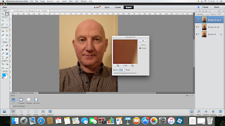
Firstly I copied the photo into a new layer. Then I chose the 'healing brush tool', I zoomed in onto parts of the face where I drew small lines across wrinkles and spots. This smooths out the wrinkle and gets rid of blemishes.
I duplicated the edited image as another new layer, opened the layer palette and dragged the layer to the sticky note icon at the bottom. Next I went to the filter menu, to blur then Gaussian blur. A box opened, I adjusted it until how smooth I wanted the skin. I put the opacity to 50%.
After I created a layer mask, set my foreground colour to black (by pressing D then X on the keyboard) and selected the paintbrush tool in the tool palette. I painted over the eyes, hair, lips and anywhere else to stop them being blurry.
I merged the layers together and saved the image as a JPEG.
Before and after
The final image from this was successful, the wrinkles are more subtle without looking to unnatural. I found the steps quite simple to get the final result and was very effective.
Project 3 - Tilt shift
Research
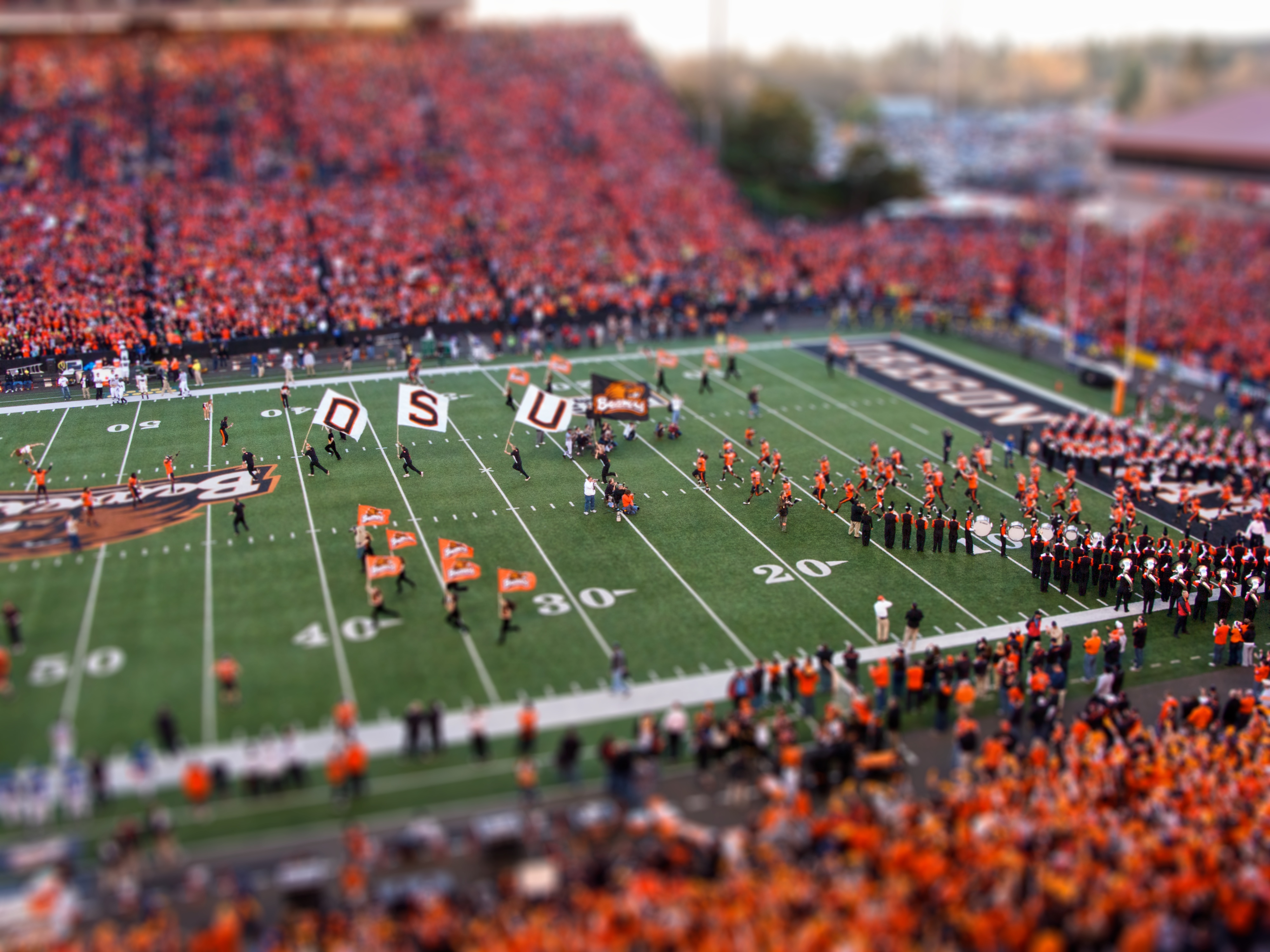
Tilt shift photography is the use of camera movement on small and medium format cameras. Selective focus can be used to simulate a miniature scene. The same effect can also be done post production. It can have better results as you can easily control the area in focus and the amount of blur.
How I made it:
I first chose a photo that I had taken from above. I then created a new layer. I pressed command key and Q to turn on quick mask mode.
I pressed the gradient tool and chose the Reflected Gradient.
I drew a line of what i wanted in focus. After I pressed Q to exit Quick Mask Mode.
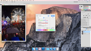 Then I went to Filter- Blur - Lens Blur. I adjusted some of the settings until I was happy with how it looked. I clicked Ok and pressed CTRL - D to get rid of the selection.
I went to Adjustments- Hue/saturation and put the saturation to +40. This made it look more like a model.
Final Image
Before and After
EvaluationI really like the effect that the tilt shift gives, it makes it look as though it is a model. I increased the saturation as a model would be brightly coloured. The process to create the final image was quite simple on photoshop and I will try it again will photos of cars from above to experiment more with the technique.
Project 4 - Hockney joiners
Research
David Hockney is an English painter, draughtsman, printmaker, stage designer and photographer. He is considered one of the most influential British artists of the 20th century and this is because of his contribution to the pop art movement in the 1960s.
In the early 1980's Hockney began to produce photo collages which he called 'joiners'. He would use polaroids and prints of a subject from different perspectives, then puts them together into a new image.
How I made it:
First I opened up the photo I wanted to use in photoshop. I made a new picture base and made the height and width 500 pixels. On the blank square I went to Select then Select All. Then to Edit - Stroke. In the dialogue box select 2 pixels and clicked the Inside location button. Next I clicked Deselect.
After I went to Edit - Define Pattern, the dialogue box came up and I named the pattern Square. The blank square can be closed.
I created a new layer in the original photo. In the
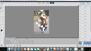 new layer I went to Edit - Fill, in the dialogue box from the drop down menu I chose Pattern and picked the one I made before called Square. Press Command key and I, this turns the grid black. At the top of the layers palette from the drop down menu I chose Screen. Now the photo can be seen.
Next I selected the Magic Wand Tool, then pressed the first square. I opened Actions and clicked New, I named it Joiner, then clicked Record.
I clicked the background layer, held the command key and pressed the J key. I pressed 8 to changed to opacity to 80%. I clicked the grid layer and stopped the action.
I clicked the next square and played the Joiners action. I did the same thing for all the squares. I then created a new layer from the background and filled it white.
I selected Auto Select Layer and moved around the squares.
I added shadow to each square and copied some layer to make them stand out more. This made the image more effective.
Final Image
Before + after
Evaluation
I like the joiners style of art because it can makes the image more interesting. Its makes it harder to see what the photo is of. Once you have done the first steps and saved the action it is quite quick to make a layer out of each square which makes it easy to do. If I did this again I would use bigger squares.
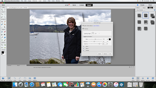
Hand coloured images were first used at the turn of the century and were used by portrait photographers to introducer colour to black and white images. The black and white pictures where hand tinted by colourists and gave a hint of colour to the image. Often only part of the image is in colour.
How I made it:
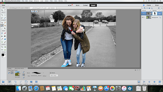
Fist I opened the photo I wanted to edit in photoshop and made a copy of it. On the copied layer I went to Image-Adjustments-Hue/Saturation. A dialogue box will open with three sliders, I dragged the saturation slider to make the image black and white.
Next I added a vector mask to the layer by clicking on the circle in a box at the top of the layers palette. After I selected the brush tool and made sure the foreground colour was black. I painted over the people in my photo which is what I wanted to be in colour. I toned down the colour to make it more like a hand coloured image by going to Image-Adjustments-Levels, a dialogue box opened and moved the gradient slider (black arrow) to the right which makes the colour more subdued.
To add a bit of colour to the rest of the photo I adjusted the opacity in the hue/saturation layer.
I added a yellow tint to the whole image and exported it.
Evaluation-
I like the how the final image looked. The editing gives it a vintage feel to it. The steps to creating it where good as you can adjust a lot of steps to make your image look how you want it to. I would definitely use this process again as I think it could improve a lot of photos and give them a different mood.
Project 7 - Paul M Smith
Research-
Paul M Smith (born 1969) is a British photographer who edits his multiple photos to create scenes. It looks like there are a few people in the photo but they are all one person.
Smith completed a Masters degree in photography, during this he examined the meaning and construction of masculinity. He also created the cd cover for Robbie Williams.
To create his images he takes multiple images with the camera set up in the same place. Each photo the person moves to act as a different character. These are then layered up and edited to put them all into one photo.
When I first looked at his work I didn't realise that it was the same person. I think this makes it more intriguing as each of the people are interacting with each other. I also like how some of the photos, such as the ones in the pub, are quite ordinary scenes. I like this because at first it looks like a quick picture taken on a night out, but because the way he has manipulated the photo makes it more interesting.
Try out images-
This photo is quite simple but I wanted to make one with less people in first to try out the editing process.
I uploaded the photos to my computer and opened them in photoshop. I first put one photo onto another. I made sure it was lined up the same as each other. I then set the opacity to 50% and selected the eraser tool. I put it over the person which was the background layer to rub out that part of the top layer. This made it so both people could be seen. After I set the opacity back to 100% and merged the layers. I did the same steps again with the final photo.
I saved the image and slightly edited the colour and saturation of the photo to improve it.
From this test shoot I now know how best to edit the photos. On my final image I will spend more time when using the eraser to get all the detail. There was a lot of thin hair which I rushed and so in the final image you can see where the hair just stops. Also the duvet moved each time I sat on it so it made it hard to put the photos together. In the final photo I will make sure the objects in the photo won't move.
Project 5 -
Creating a vignette can emphasise part of a image.
How I made it:

I opened up the image I wanted to use in photoshop and created a new layer from it. I selected the rectangular marquee tool and drew the shape around the person in my image. I went to Select and then Transform Selection. This let me move the shape and tilt it slightly to how I wanted it.
After I created another layer, while in the new layer I clicked Add a Layerstyle, and from the drop down menu chose Drop Shadow. I adjusted the sliders to change the thickness of the shadow.
Then I went back to layer 1 and went to Image-Adjustments-Hue/saturation and made it so the background loose some colour, this made the rectangle part of the image stand out more. I also went back to that layer and increased the saturation.
Evaluation- I don't like the final image from this project as I don't think it looks professional. I think maybe it would work better using another image. I do like how the main subject stand out from the rest of the image because of the saturation. If I did it again I would try different shadow adjustments to improve it and blend more into the background.
Project 6 - Hand coloured image
Hand coloured images were first used at the turn of the century and were used by portrait photographers to introducer colour to black and white images. The black and white pictures where hand tinted by colourists and gave a hint of colour to the image. Often only part of the image is in colour.
How I made it:

Fist I opened the photo I wanted to edit in photoshop and made a copy of it. On the copied layer I went to Image-Adjustments-Hue/Saturation. A dialogue box will open with three sliders, I dragged the saturation slider to make the image black and white.
Next I added a vector mask to the layer by clicking on the circle in a box at the top of the layers palette. After I selected the brush tool and made sure the foreground colour was black. I painted over the people in my photo which is what I wanted to be in colour. I toned down the colour to make it more like a hand coloured image by going to Image-Adjustments-Levels, a dialogue box opened and moved the gradient slider (black arrow) to the right which makes the colour more subdued.
To add a bit of colour to the rest of the photo I adjusted the opacity in the hue/saturation layer.
I added a yellow tint to the whole image and exported it.
I like the how the final image looked. The editing gives it a vintage feel to it. The steps to creating it where good as you can adjust a lot of steps to make your image look how you want it to. I would definitely use this process again as I think it could improve a lot of photos and give them a different mood.
Project 7 - Paul M Smith
Research-
Paul M Smith (born 1969) is a British photographer who edits his multiple photos to create scenes. It looks like there are a few people in the photo but they are all one person.
Smith completed a Masters degree in photography, during this he examined the meaning and construction of masculinity. He also created the cd cover for Robbie Williams.
To create his images he takes multiple images with the camera set up in the same place. Each photo the person moves to act as a different character. These are then layered up and edited to put them all into one photo.
When I first looked at his work I didn't realise that it was the same person. I think this makes it more intriguing as each of the people are interacting with each other. I also like how some of the photos, such as the ones in the pub, are quite ordinary scenes. I like this because at first it looks like a quick picture taken on a night out, but because the way he has manipulated the photo makes it more interesting.
Try out images-
This photo is quite simple but I wanted to make one with less people in first to try out the editing process.
How I made it:
I set up my camera on the tripod and position it to where I wanted my photo to be. I set the self timer and as it was counting down I sat on the bed and waited for the picture to take. I did this 3 times, sitting in a different place each time.I uploaded the photos to my computer and opened them in photoshop. I first put one photo onto another. I made sure it was lined up the same as each other. I then set the opacity to 50% and selected the eraser tool. I put it over the person which was the background layer to rub out that part of the top layer. This made it so both people could be seen. After I set the opacity back to 100% and merged the layers. I did the same steps again with the final photo.
I saved the image and slightly edited the colour and saturation of the photo to improve it.
From this test shoot I now know how best to edit the photos. On my final image I will spend more time when using the eraser to get all the detail. There was a lot of thin hair which I rushed and so in the final image you can see where the hair just stops. Also the duvet moved each time I sat on it so it made it hard to put the photos together. In the final photo I will make sure the objects in the photo won't move.
Final image
I decided to make my final photo of a dinner scene because this was a good way of having 5 people in the image. I followed the same steps as my try out images but followed them 5 times. I also changed it to black and white as I think this improved it.
Evaluation
I have really enjoyed this unit of work as I have learnt new techniques on photoshop. Also following the steps on each project has let me make some interesting work. I haven't liked all the finished photos, like the vignetting but the rest I will definitely use again.




No comments:
Post a Comment